

A Mobile HR Experience: From Desktop to Mobile
OVERVIEW
Managing employees on-the-go was difficult for small business teams using our HR platform, Personelle, which was primarily designed for desktop use. While the web app was accessible on mobile, it wasn’t optimized for quick, real-time actions like clocking in, checking schedules, or requesting time off.
I contributed to the end-to-end design of a native mobile experience that reimagined how workforce management tools should function in a mobile context—prioritizing speed, clarity, and usability.
My Role
UX Designer
Skills
UX Research
Competitive Analysis
User Personas
Information Architecture
Wireframing
Prototyping
Visual Design
RESEARCH
To understand how to design effectively for mobile, I conducted a competitive analysis across dozens of HR platforms, evaluating both their web and mobile experiences.

Key Observations:
-
Mobile apps prioritized accessibility and clarity over feature density
-
Information was often structured using card-based layouts for quick scanning
-
Mobile introduced gesture-based interactions
-
Core actions were immediately accessible from the home screen
User Personas
Based on research and competitive analysis, we identified two primary user groups: employees who need quick access to everyday tasks, and managers who require visibility and control while on the go. These personas helped guide design decisions around navigation, content prioritization, and feature accessibility.


DEFINING THE PROBLEM
Users need a faster, more intuitive way to complete essential HR tasks on mobile without navigating through complex, desktop-oriented layouts.
IDEATION
To ensure a seamless experience, I mapped out user flows for core actions: clocking in, requesting time off, and viewing schedules. This simplified our navigation structure and helped with prioritizing high frequency actions, reducing unnecessary steps, and creating a more intuitive app structure.


DESIGN PROCESS
Sketches
Using insights from research and user flows, I created early sketches to explore how the desktop experience could be reimagined for mobile. These rough concepts focused on simplicity and functionality in order to reduce cognitive overload in our data-heavy product. This included replacing tables with expandable cards, a bottom navigation bar for quick access to key features, and placing high-priority actions at the top of the screen for easy access.

Home
Maintains the dashboard's widget design with the most important widgets on top for easy access.

Profile
Instead of showing all employee records, the user's personal info can be shown in the profile, with a similar design as desktop.

Time Clock
Clock-in CTA is at the top because it's the most important. Timesheets can be expandable cards instead of tables to utilize space.

My Schedule
Completely new schedule design for mobile so users can easily see their next shifts for the week.

Team Schedule
Follows new design for My Schedule where all scheduled employees are shown for the week.

My Time Off
Request time off CTA is on top because it's the most important. Upcoming time off shown in cards to utilize space.

Team's Time Off
Can be shown in a calendar format so users can easily visualize upcoming time off for the month.
Low-Fidelity Wireframes
I translated our sketches into low-fidelity wireframes to define the app’s structure, layout, and content hierarchy. These wireframes allowed me to refine navigation, organize information-heavy screens, and test how key tasks would function in a more realistic mobile interface before moving into high-fidelity designs.


High-Fidelity Mockups
Building off the low-fidelity wireframes, I helped develop high-fidelity mockups to bring the mobile experience to life through refined visuals, interactions, and mobile friendliness. To maintain consistency across platforms, the mobile app also utilized the same design system and style guide as the desktop web app, creating a cohesive experience while adapting components and layouts for mobile use.
Homepage

Profile

My Time Clock

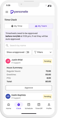
My Team's Time Clock
My Team's Time Off:
Calendar View

My Team's Time Off:
List View
My Team's Time Off:
List View

My Time Off

Request Time Off

My Schedule:
List View

My Schedule:
Calendar View

My Team's Schedule:
Shift View

My Team's Schedule:
Employee View

Interactive Prototypes
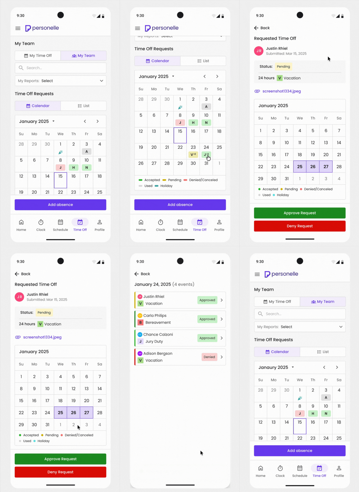
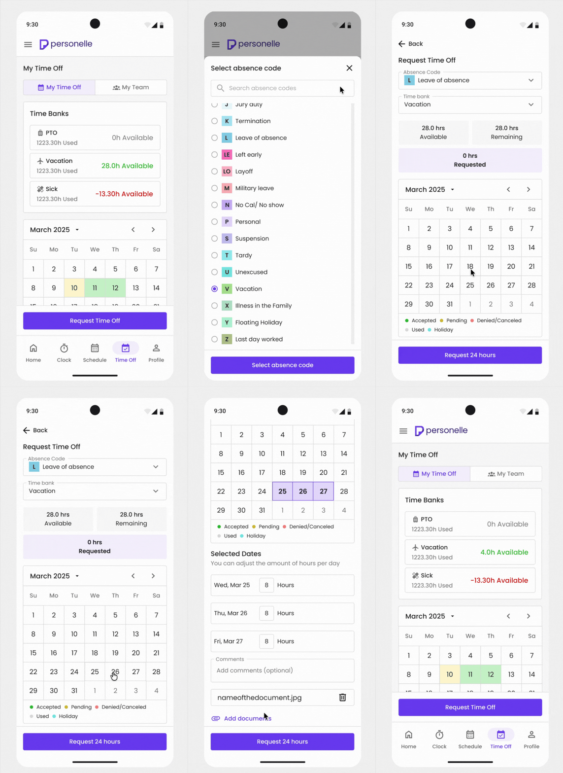
To demonstrate how the final designs would function in a real-world experience, I created interactive prototypes. These prototypes helped visualize screen transitions, interactions, and task flows, allowing stakeholders and developers to better understand the user experience before implementation.
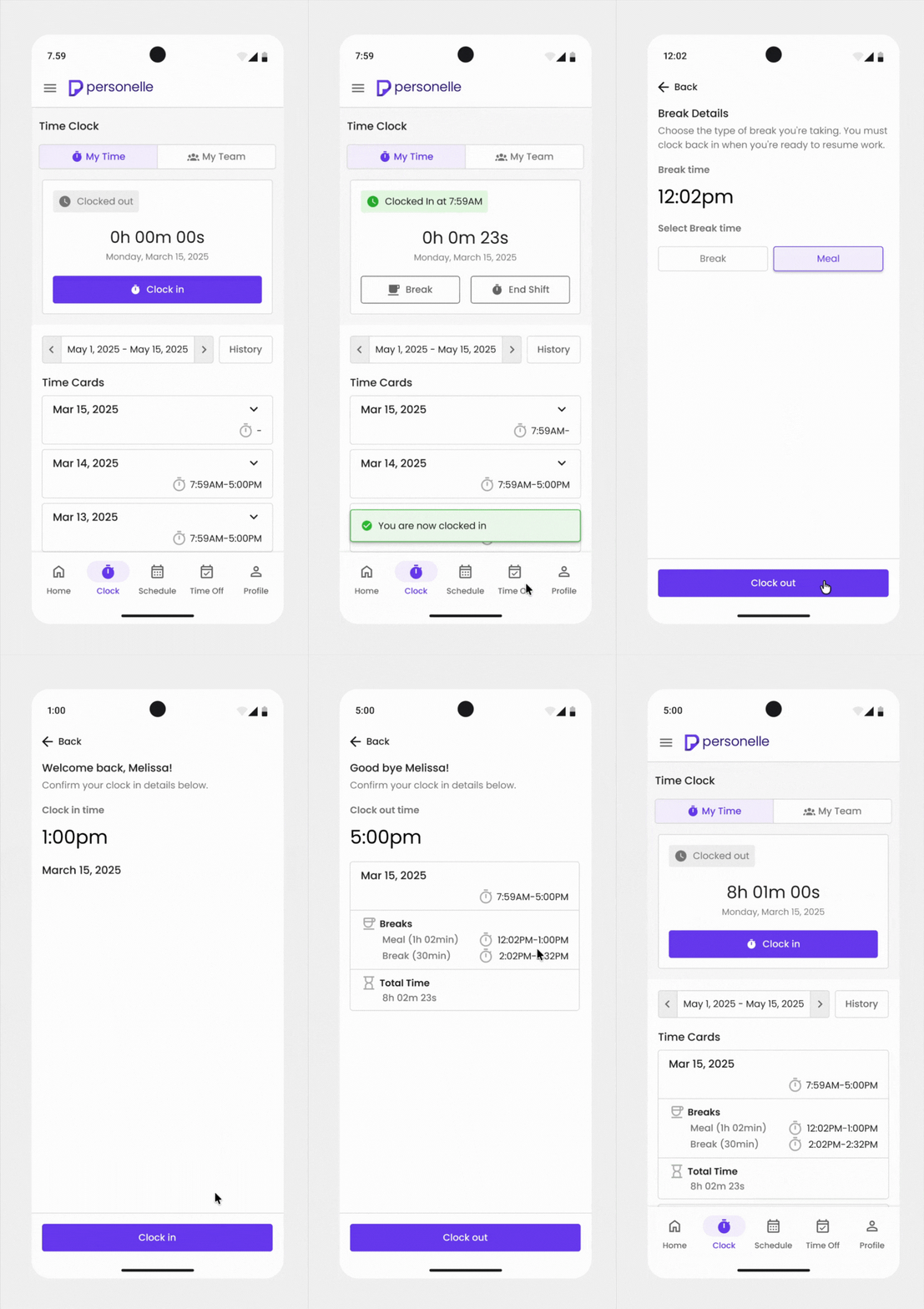
Clock In/Out
Approve Time Off Request
Request Time Off
OUTCOME
The final result was a mobile-first workforce management experience that transformed key HR tasks into a more accessible experience for employees and managers on the go, while maintaining consistency with the existing overall product experience. The app streamlined actions such as having a centralized homepage for key actions, quick clock in and out functionalities, clear visibility in viewing schedules, simplified navigation for requesting time off, clearer information hierarchy, and mobile optimized interactions.
LEARNINGS & TAKEAWAYS
Through research, exploration, and iteration, I expanded my knowledge on how to adapt a desktop experience into a seamless mobile experience. Information heavy workflows needed to be simplified and reorganized to support quick interactions for users. Additionally, this project reinforced the importance of prioritizing high-frequency actions, creating clear information hierarchy, and using mobile patterns such as expandable cards and bottom navigation to improve usability.