
A Rebrand Case Study: From Idea to Identity
OVERVIEW
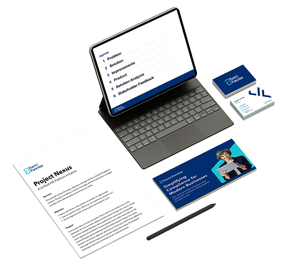
I collaborated with cross-functional stakeholders to develop the brand identity and marketing website for Form & Function, a company providing digital compliance solutions through HR software. Starting from a defined mission and brand direction, I helped translate abstract ideas into a cohesive visual identity and user-facing website.
My Role
UX Designer
Skills
Brand Strategy
Visual Identity Design
UX & Web Design
Research
GOALS
01
Establish a more intentional and professional brand
02
Reflect the company’s focus on compliance and functionality
03
Create a unified identity across product and marketing
DEFINING THE BRAND
To align on the brand direction, I helped conduct a collaborative brand personification workshop where stakeholders defined the product through personification exercises. Using post-it notes, participants responded to prompts like “If this product were a person, how would you describe its personality?”

Through affinity mapping, we grouped responses to identify recurring themes and establish a shared set of core brand attributes. Key themes that emerged included trustworthiness, structure, efficiency, and approachability, which directly informed the visual identity and design decisions.
RENAMING THE BRAND
Exploration
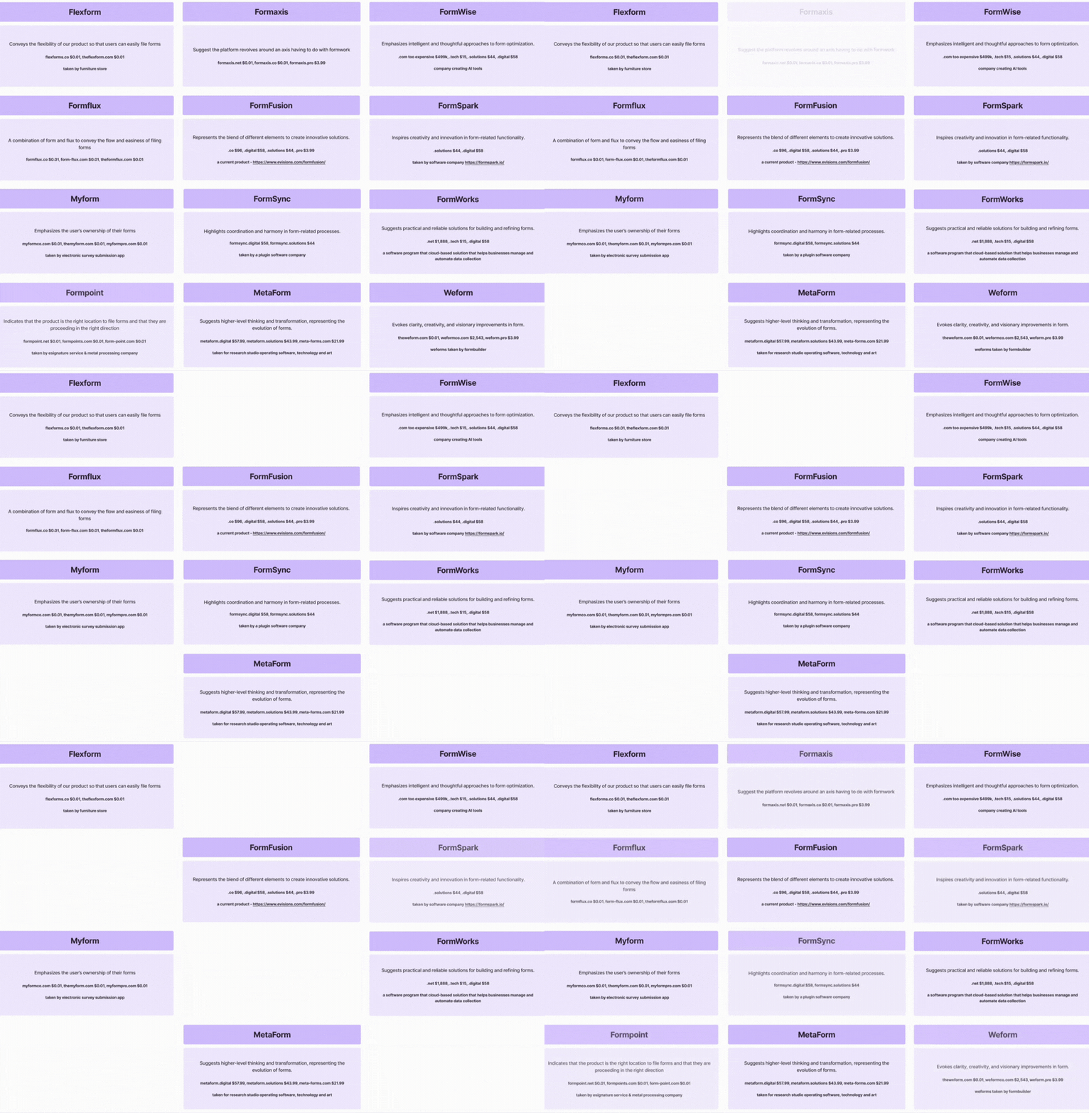
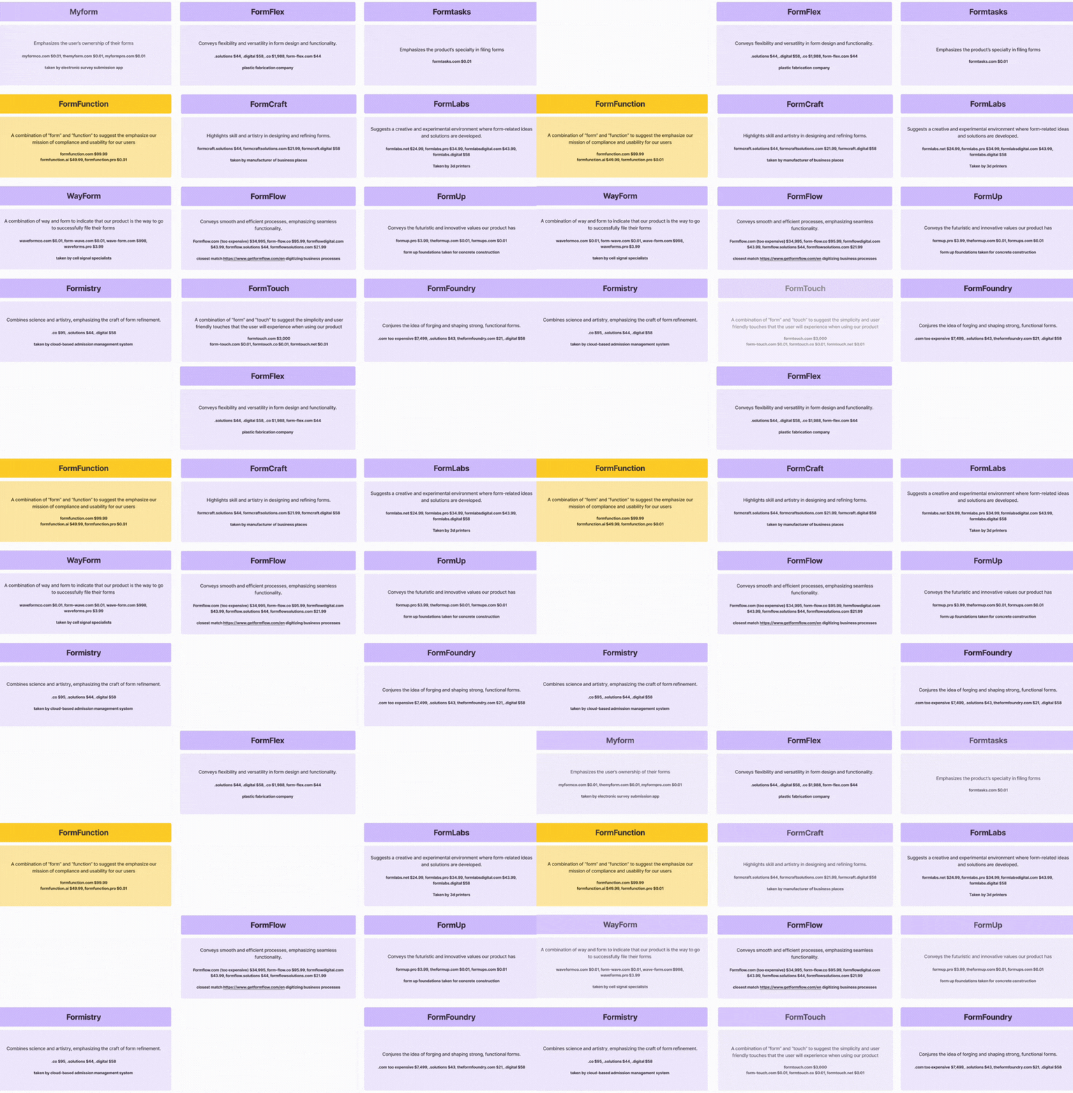
The renaming process began with individual exploration, where I generated a wide range of ideas centered around “forms” and compliance. We then came together as a team to consolidate and evaluate ideas using FigJam, allowing us to identify stronger directions and build on each other's thinking. From there, we presented naming directions to stakeholders for feedback. As a result, we went through multiple rounds of exploration—ultimately proposing hundreds of name options before aligning on a final direction
Outcome
The name Form & Function was chosen to emphasize two key ideas:
Form → structure, compliance, and organization
Function → usability, efficiency, and product value
LOGO IDEATION


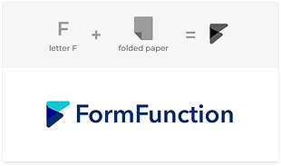
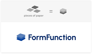
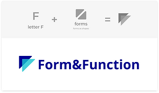

I explored dozens of concepts centered around the "F" letter for the name Form&Function by experimenting with different compositions to achieve a logomark that felt clean, professional, and modern. Throughout this process, we held many rounds of logo proposals with stakeholders to gather feedback so we could refine our direction to better align with the desired brand perception.
COLOR PALETTE
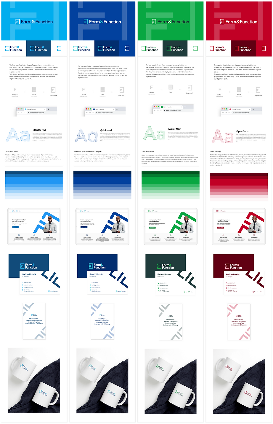
I proposed multiple palette directions:
Blue tones:
trust and reliability
Green tones:
growth and success
Red tones:
boldness and energy
FINAL LOGO
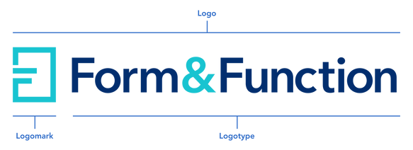
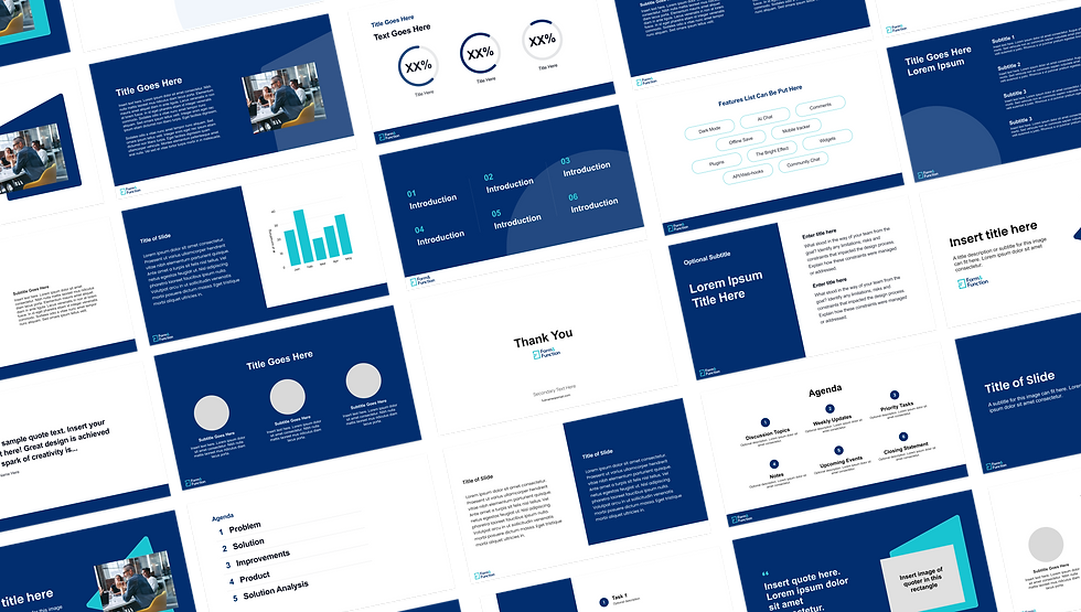
The final logo uses the “F” letterform to subtly reference the concept of forms. The logo establishes a recognizable and cohesive identity that remains clean, scalable, and versatile across applications. The blue color palette reinforces trust and professionalism, aligning with the company’s role as a compliance-focused digital platform.
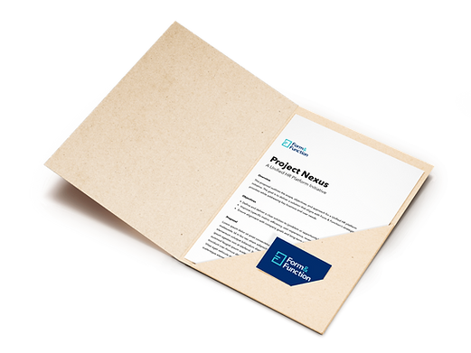
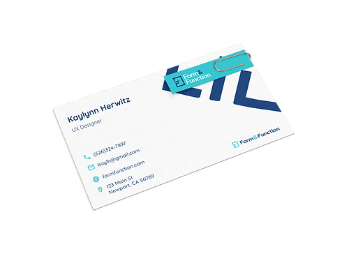
BRINGING THE BRAND TO LIFE
Banners




Powerpoint Slides
Email Signature

Company Merchandise

Outcome
-
Successfully contributed to naming the company
-
Delivered a cohesive brand identity
-
Established a strong visual foundation for future growth
-
Translated abstract ideas into visual systems
-
Iterated through multiple concepts and evaluated tradeoffs