
Designing a Responsive Experience

OVERVIEW
Responsive design is more than simply resizing screens—it is about creating flexible experiences that adapt to different devices while preserving usability, accessibility, and content hierarchy.
In this project, I applied responsive design principles to Personelle, an HR web application, to ensure our platform remained functional and intuitive across all screen sizes, from large desktop monitors to mobile devices.
My Role
UX Designer
Skills
UX Design
Responsive Design
User Personas
Problem Solving
THE GOAL
Create a responsive HR platform that allows users to manage employees, track time and attendance, and support hiring and employee growth from any device. The experience needs to remain consistent and easy to use regardless of screen size, ensuring that critical workflows such as clocking in, viewing schedules, and managing employee data are always accessible.
UNDERSTANDING OUR USERS
Extensive research about our users revealed that our primary users—employees, managers, and HR administrators—mostly accessed the platform on desktop devices. However, we recognized that users could still access our platform from tablets or mobile devices. Therefore, we approached the design of our web app with a desktop-first approach, but created every component and screen with responsiveness in mind. We also knew the product roadmap included a dedicated mobile app in the future. Until then, the web application needed to provide a reliable experience across all screen sizes.


RESPONSIVE DESIGN IN PRACTICE
Most components were designed with scalability so they could adapt to any screen size with minimal adjustments. This allowed users to complete essential tasks whether they were working on a desktop computer, tablet, or smartphone.

1920px
1440px
960px
600px
375px
The dashboard was built using modular widgets to adapt fluidly across breakpoints by automatically rearranging, expanding, or shrinking to fit different screen sizes while maintaining a clear and organized layout.

1920px
1440px
960px
600px
375px
On desktop, all settings categories are displayed in a side navigation. On mobile, the navigation is hidden to maximize screen space, with a back button to return users to the setting menu when needed.

1920px
1440px
960px
600px
375px
On desktop, the scheduling view displays one full week at a time so users can easily see and manage their shifts. In smaller screens, the number of visible days is reduced to maintain readability and usability.
CHALLENGE
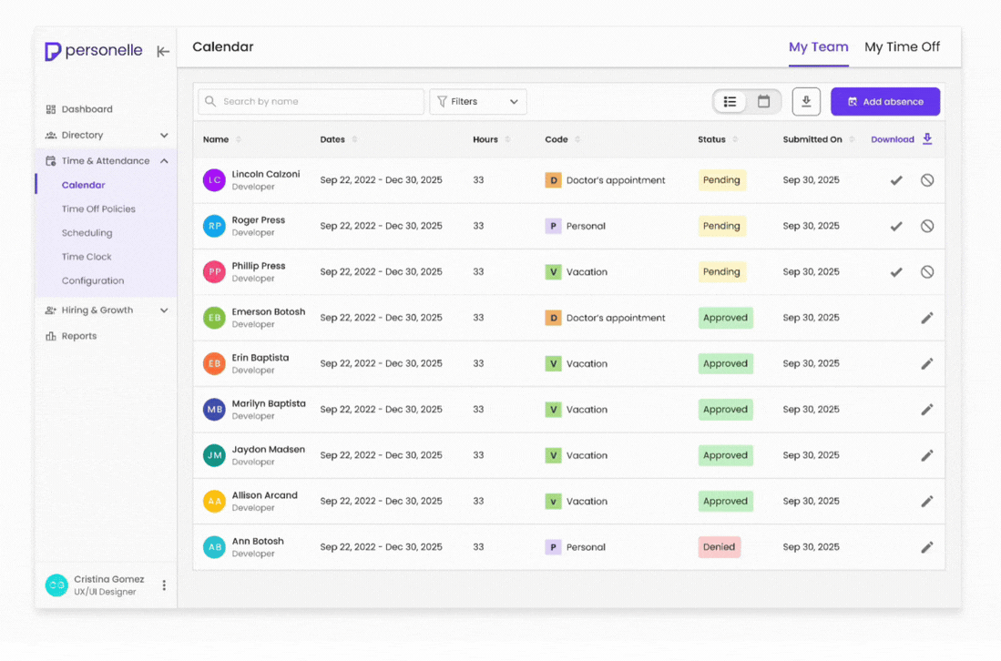
A responsive design challenge we faced involved data tables. Tables were a core part of the platform, used to display critical information such as employee records, time off, and attendance data. While they worked well on desktop, their wide structure made them difficult to use on smaller screens.
Data-heavy tables did not translate well to smaller screens
Phase 01 Iteration: Reducing Table Content
Our first approach was to reduce content so the table could fit within smaller screens.


Why it didn't work
-
Important information hidden
-
Less visibility into data
-
Experience felt incomplete and less efficient
Phase 02 Iteration: Accordion Tables
Our final solution transformed each table row into an accordion within smaller screens. Users could see essential information at a glance and expand individual rows to reveal additional details when needed.

Benefits of this approach
-
Keeps access to all information
-
Improves readability on mobile
-
Maintains table structure
Outcome: Tables in Responsive

1920px
1440px
960px
600px
375px
On desktop, data is shown in a traditional table format for efficient scanning. In smaller screens, we use accordion tables, so users can expand and view additional details while preserving access to all information.
CONCLUSION
This project reinforced the importance of designing responsively. By combining user research, desktop-first planning, and iterative problem-solving, I helped create a scalable experience that adapts to any screen size. The table redesign, in particular, demonstrated my ability to balance business requirements with usability needs and develop thoughtful solutions for complex interface challenges.