
Designing a Unified Design System

OVERVIEW
I created a design system and UI style guide to standardize visual patterns across the platform. Starting from a fragmented set of existing designs, I audited the product, consolidated inconsistencies, and created a scalable system of reusable components and foundations.
My Role
UX Designer
Skills
Design Systems
UI Design
Systems Thinking
Design Audit
CONTEXT
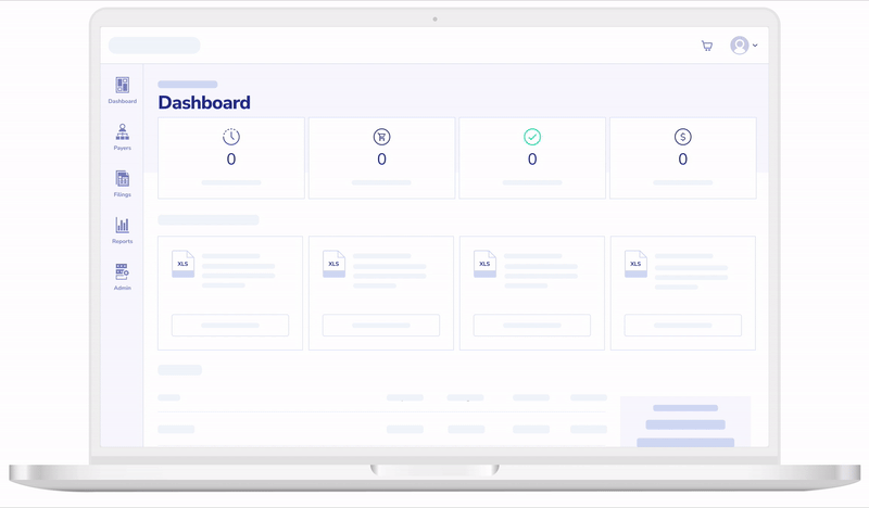
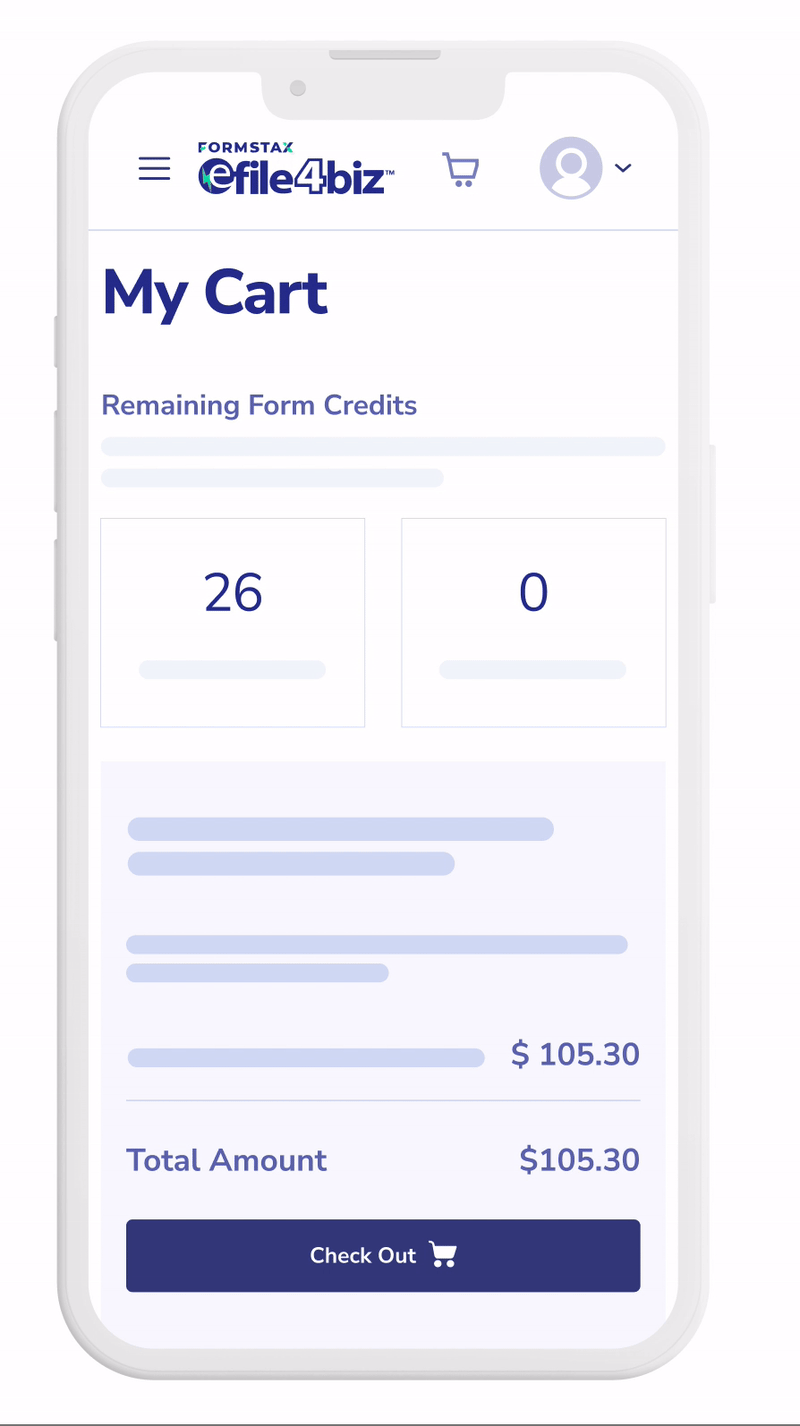
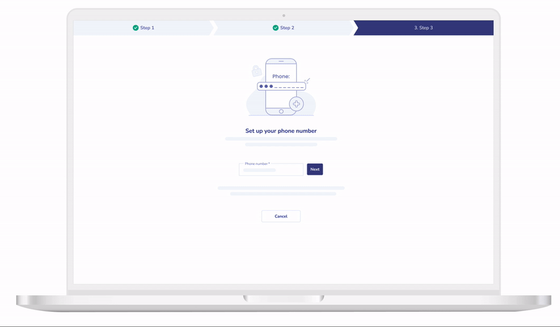
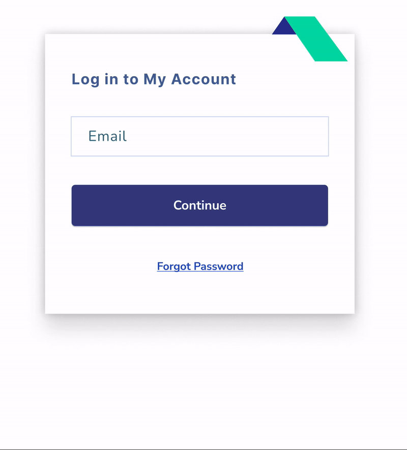
Before joining the team, our product had been worked on by many people without a centralized design system. As a result, the interface became inconsistent, with many variations in typography, color usage, and component styles across the platform.
Additionally, our designs existed in various locations, whether it was outdated files on Figma that contained screenshots instead of editable components, designs on Zeplin, or designs from production.
As a result, there was no single source of truth for our designs. To resolve this, I conducted a comprehensive audit of our platform to create a style guide and unified design system.


Inconsistent icon colors
#3E5D96
#011E9B
#48539F
#2B3690
#47649C
#3353BC
THE PROBLEM
Inconsistent user interface across platform
UI elements such as button styles, typography sizes and weights, and colors varied across the platform, making the interface feel fragmented and reducing visual clarity for users.
Lack of unified design system
The platform lacked a shared design system to unify the product's visual language, causing design decisions to be made ad hoc, and increasing design drift over time.
Inefficient support for product development
Reusable components and guidelines did not exist, slowing down the design process and creating bottlenecks when teams needed design input quickly.
THE GOAL
01
Standardize UI components and visual styles across
the platform
02
Provide reusable components to for faster design
and development
03
Establish a shared design language between designers and developers
RESEARCH
To identify the inconsistencies within our platform, I conducted a UI audit and pattern analysis by reviewing all screens across the platform and documenting different versions of components and visual styles being used. By cataloging all these variations, I was able to identify inconsistent patterns and duplicated component styles.

All color variations used throughout the platform
All text styles used throughout the platform

STYLE GUIDE
I established a UI Style Guide to define the foundational visual elements to create a consistent visual language as a basis for all the components within the design system. Utilizing Figma, I created text styles and color styles in the shared library for our team to access, and I established a spatial system and margin guidelines to standardize our spacing. These foundations ensured that all our UI elements followed a cohesive and predictable system, which improved both usability and design consistency across the platform.

CREATING THE SYSTEM
Atomic Design
To ensure the design system was scalable and easy to maintain, I structured it using the Atomic Design methodology. This approach involved breaking down interface elements into hierarchical building blocks - atoms, molecules, organisms, templates, and pages. By organizing the system this way, components remained reusable and flexible, allowing for efficient designing, consistency, and scalability.

Creating Dynamic Components
In order to create a design system that made designing efficient and organized, I designed components to be dynamic and adaptable across different use cases. With dynamic components, I can easily switch between different attributes of a component, allowing a singular component to serve multiple purposes so our design team can quickly customize components to fit their needs.


Changing the state of a component
Adapt components for responsive screens
Auto-Layout
To ensure components were flexible for responsive sizing, I utilized Auto Layout in Figma to build scalable components. This allowed components to automatically adjust wherever they were used, including resizing dynamically based on text length, maintaining consistent spacing across different screen sizes, and adapting to different layouts. By using Auto Layout, our design system could support efficient design workflows and visual consistency for a better experience for our users.

Efficiently add components into a frame
Duplicate components easily while maintaining sizing
Creating a Shared Component Library
I developed a centralized shared component library for our design system to ensure consistent designs were used across the design team. By providing a shared library of reusable components, we were able to design more efficiently, maintain consistency across our product, and reduce duplicated work, thus increasing productivity.

IMPACT
Improved design consistency
By standardizing UI components and visual styles, the platform now has a more cohesive and unified user experience. Inconsistencies in elements such as buttons, typography, and color usage were eliminated, resulting in clearer and more predictable interfaces.
Increased Design & Development Efficiency
With a centralized library of reusable components and templates, designers and developers can now build new features more quickly. Product owners and developers are able to move faster when iterating on or launching new features, as they can rely on pre-defined patterns and components.This reduces the need to recreate UI elements from scratch and streamlines both design and implementation workflows.
Reduced Design Debt
By consolidating inconsistent UI patterns into a single system, the design system helps eliminate duplication and prevents further inconsistencies, making the product easier to maintain over time.